MTS Pronto
A transit app aimed to improve boarding times & efficiency for students & commuters

ROLE
UX Designer
DURATION
3 Months
PLATFORM
Mobile Application

PROBLEM
College students & commuters often faced frustration locating and boarding the bus.
As a commuting student myself, I noticed that the existing Pronto Bus app’s method of utilizing QR codes failed to scan very frequently and the lack of information regarding the bus’s whereabouts often caused frustration for not only the bus driver, but also for students trying to arrive to school on time.
“How might we improve transit efficiency and reduce boarding times for students trying to commute to school?”
SOLUTION
Implementing NFC & Live-Tracking Features
Implement NFC (Near-Field Communication)
Allows for quick and more efficient bus boarding
NFC’s are more secure than QR codes
Allows for integration with Apple Wallet
Faster and more convenient than QR codes
NFC eliminates scanning errors and reduces average boarding time from 7-10 seconds to 1 second (~85% faster), enabling seamless, frustration-free commuting.

Implement Live-Tracking Features
Allows students to see where the current bus is in order to plan their trips efficiently.
Reduces the likelihood of students missing classes as they’d be able to plan the commute more effectively.
Enhanced safety and security during late-night hours as students will know exactly where their bus is.

BEFORE THE REDESIGN: PAIN POINTS & CHALLENGES

Before redesigning Pronto, I analyzed the existing UX issues through user feedback and personal testing. The most common complaints revolved around difficulties scanning QR codes, lack of real-time tracking, and a confusing payment system. These challenges often led to frustration, delays, and a lack of confidence in the app.
From a UX perspective, the current app was text-heavy & had a high cognitive load.
Below is a breakdown of the key UX challenges identified in the previous design and how they impacted user experience.
With these UX challenges identified, I explored how other popular transit apps addressed similar issues, providing insights into opportunities for Pronto’s redesign.
Pain Point
Issue
Impact
QR Code Fails
Hard to scan, slow to load
Riders were delayed, misssed busses
Payment System
Confusing balance & loading
Users struggled to add money
No Bus Tracking
No Real-Time Updates
Users couldn't plan trips efficiently
Trip Planner UI
Cluttered, not intuitive
Harder to plan routes
COMPETITIVE ANALYSIS
The competition had ways to track the bus’ whereabouts while Pronto did not.
I decided to compare the current Pronto app to popular commute tools like Google Maps and Apple Maps. In this comparison, both apps besides Pronto had a way of tracking the bus and were compatible with other applications. This provided me with solutions for the Pronto redesign while also considering that these two apps are not innately transit apps.
Apple Maps
Google Maps
USER RESEARCH
Students reported that the QR code not only failed to scan frequently, but there was no efficient way to track the bus.
Through surveys, 17 responses were recorded & I found that not only did the QR load-time took quite a significant time to load, it often failed to scan causing a line to form and students to be late to class.
RESEARCH QUESTIONS
How frequently do you use Pronto?
What specific features of the app do you use most frequently?
Rank the following features in terms of importance to your bus commuting experience, with 1 being the most important and 5 being the least important.
Real-time bus tracking
Route planning
Service alerts & notifications
Integration with other transportation apps
Accessibility features
How easy is it for you to find information about bus routes and schedules?
Are there any difficulties you face while using the app?
Are there any improvements you’d like to see on the app?
AFFINITY MAPPING
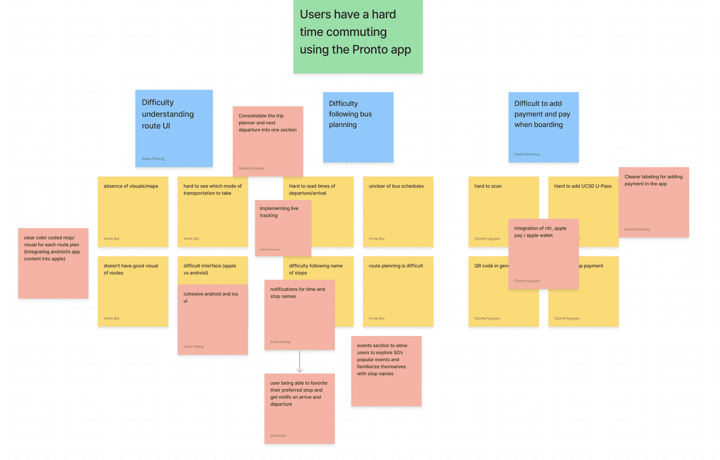
Based on the trends of the affinity map, I noticed that users have a hard time commuting using the Pronto App.
MAJOR INSIGHTS
#1
There’s difficulty understanding the app UI.
Users struggled with an absence of visuals or maps, making it hard to identify transportation options. Respondents found it difficult to determine which mode of transportation to take due to unclear information. Additionally, the app's UI was inconsistent between Apple and Android devices, leading to confusion.
Users found it hard to read departure and arrival times, leading to confusion. Unclear bus schedules made route planning difficult, and users struggled to track the bus and determine its location.
#3
It was hard to add payments & board in general.
PERSONA
Users found the QR code scanner finicky and unreliable, causing frustration. Adding the UCSD-UPass for commuting privileges was challenging, and users struggled with the payment process in the app to board buses smoothly.

“I just want to board the bus quickly and efficiently without being an inconvenience to other people!”
Bio
Rick is a hard-worker with no vehicle. He is also very introverted and hates being the center of attention. When he holds up the line, he gets very shy. He wishes there was NFC.
Rick
Hard-working student that relies on public transit
Goals & Motivations
RRick wants to board the bus quickly and efficiently without causing delays. However, the QR scanner frequently fails, making him feel pressured by others waiting in line. He wishes for NFC integration to speed up the process and reduce stress.
Pain Points / Challenges
QR Code Scanning Issues → Often fails to scan, causing delays and frustration.
Confusing Payment System → Difficult to reload funds, lacks clear feedback.
Anxiety from Holding Up the Line → Feels uncomfortable when delays draw attention.
No Real-Time Tracking → Struggles to plan trips efficiently.
This inefficient experience makes commuting stressful, reinforcing Rick’s need for a faster, more intuitive system. The solution focuses on improving live tracking and simplifying NFC payments to make his experience smoother and more seamless.
USER FLOW
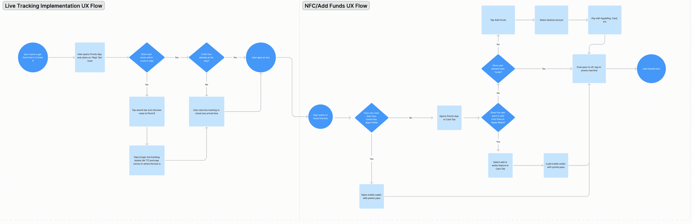
This user flow outlines how commuters interact with the redesigned Pronto app, integrating real-time tracking for seamless trip planning and NFC payments for faster boarding.
FINAL SCREENS

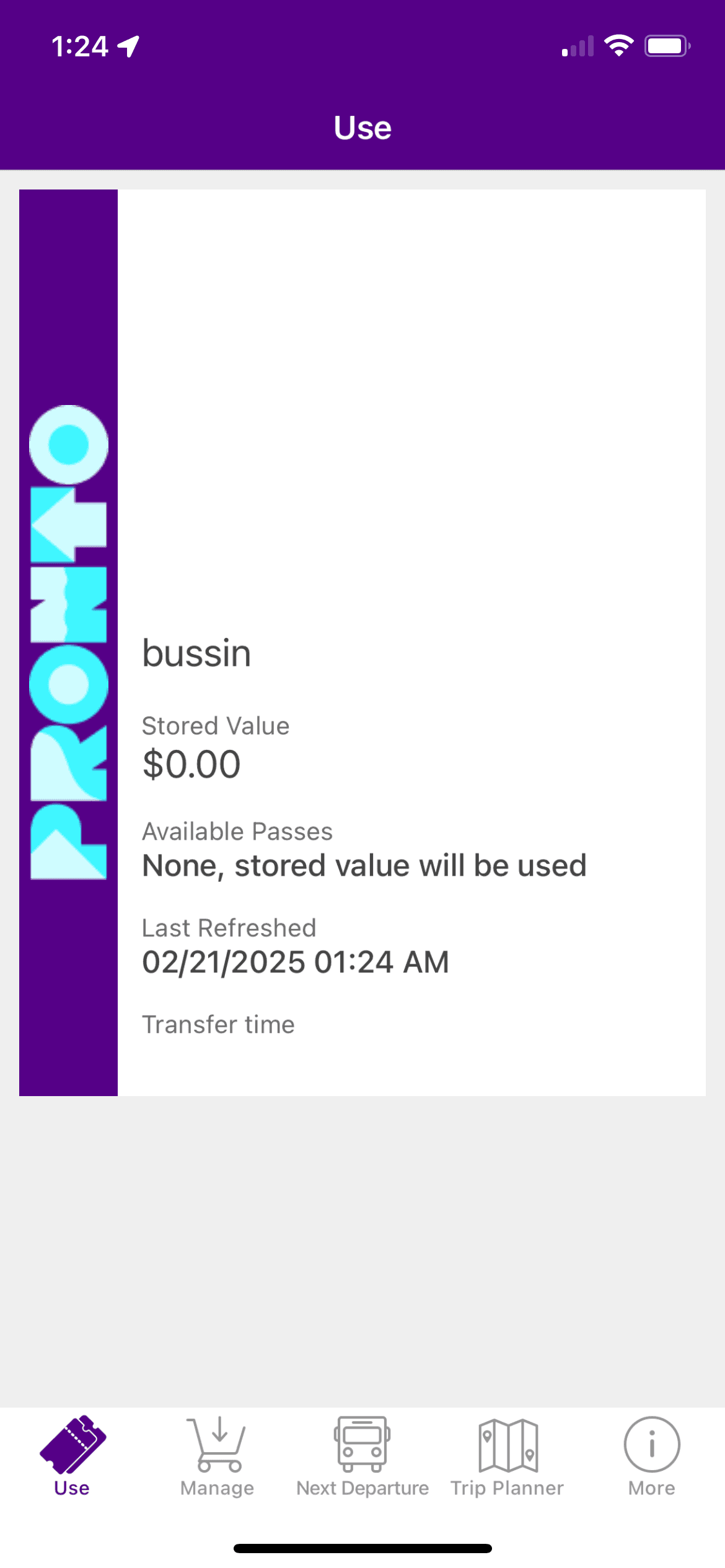
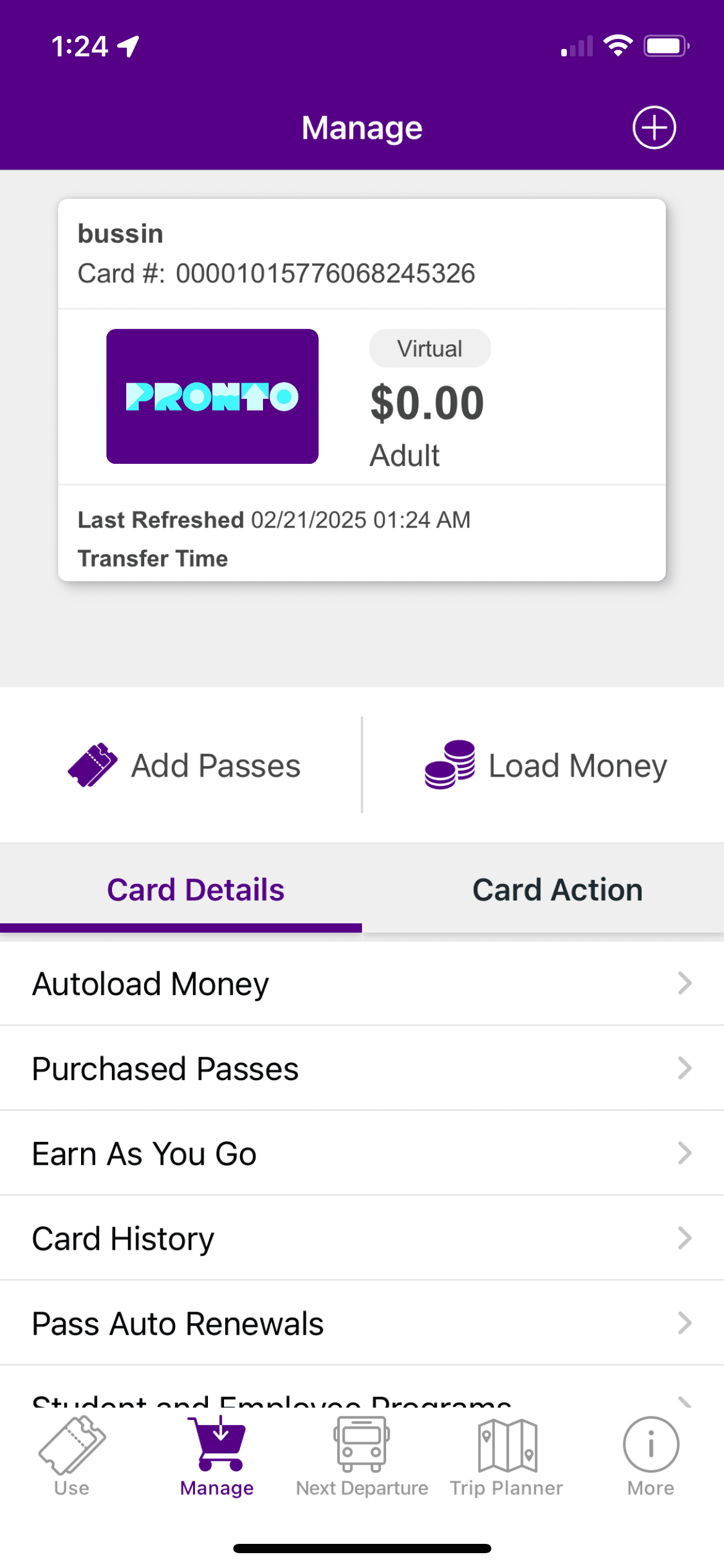
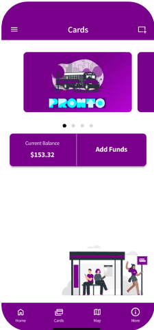
Contactless Payment Pass, allowing users to scan & deposit cash to quickly board the bus.
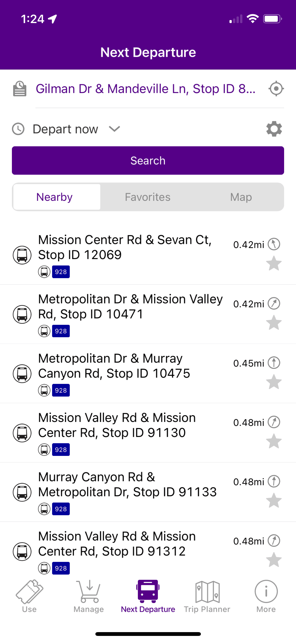
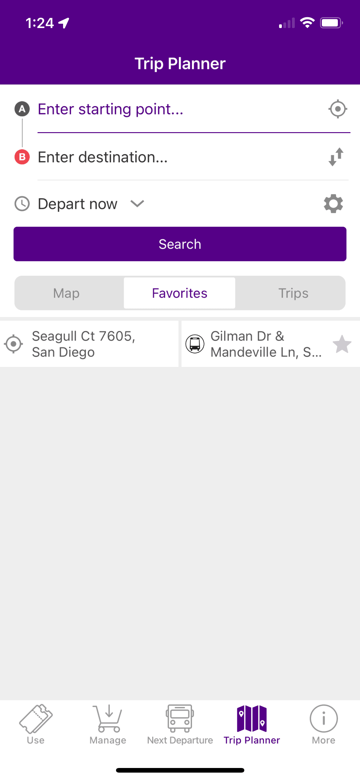
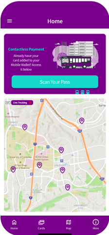
Live-tracking feature & indicators to know bus whereabouts.
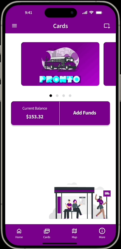
Swipe-able card feature to quickly check user balance.
“Add Funds” to efficiently and quickly deposit cash.
Iterating through user feedback drives meaningful improvements.
In future iterations, I would conduct A/B testing with various visual wireframes & prototypes to further enhance the user experience and make it even more user-friendly.
Measure meaningful UX improvements.
I would track metrics such as user engagement (time spent on the live tracking feature), task completion rates (how many users successfully add funds), and customer satisfaction via user surveys to continuously iterate and improve the app.
REFLECTIONS & TAKEAWAYS
ROLE
UX Designer
DURATION
3 Months
PLATFORM
Mobile Application
MTS Pronto
A transit app aimed to improve boarding times & efficiency for students & commuters
PROBLEM
College students & commuters often faced frustration locating and boarding the bus.
As a commuting student myself, I noticed that the Pronto Bus app’s method of utilizing QR codes failed to scan very frequently and the lack of information regarding the bus’s whereabouts often caused frustration for not only the bus driver, but also for students trying to arrive to school on time.
“How might we improve transit efficiency and reduce boarding times for students trying to commute to school?”
SOLUTION
Implementing NFC & Live-Tracking Features
Implement NFC (Near-Field Communication)
Allows for quick and more efficient bus boarding
NFC’s are more secure than QR codes
Allows for integration with Apple Wallet
Faster and more convenient than QR codes
Implement Live-Tracking Features
Allows students to see where the current bus is in order to plan their trips better.
Reduces the likelihood of students missing classes as they’d be able to plan the commute more effectively.
Enhanced safety and security during late-night hours as students will know exactly where their bus is.
COMPETITIVE ANALYSIS
The competition had ways to track the bus’ whereabouts while Pronto did not.
I decided to compare the current Pronto app to popular commute tools like Google Maps and Apple Maps. In this comparison, both apps besides Pronto had a way of tracking the bus and were compatible with other applications. This provided me with solutions for the Pronto redesign while also considering that these two apps are not innately transit apps.
MAJOR INSIGHTS
There's difficulty understanding the AP UI
Users struggled with an absence of visuals or maps, making it hard to identify transportation options. Respondents found it difficult to determine which mode of transportation to take due to unclear information. Additionally, the app's UI was inconsistent between Apple and Android devices, leading to confusion.
Following the bus planning was confusing.
Users found it hard to read departure and arrival times, leading to confusion. Unclear bus schedules made route planning difficult, and users struggled to track the bus and determine its location.
It was hard to add payments & board the bus
Users found the QR code scanner finicky and unreliable, causing frustration. Adding the UCSD-UPass for commuting privileges was challenging, and users struggled with the payment process in the app to board buses smoothly.
AFFINITY MAPPING
Based on the trends of the affinity map, I noticed that users have a hard time commuting using the Pronto App.
PERSONA

“I just want to board the bus quickly and efficiently without being an inconvenience to other people!”
Bio
Rick is a hard-worker with no vehicle. He is also very introverted and hates being the center of attention. When he holds up the line, he gets very shy. He wishes there was NFC.
Rick
Hard-working student that relies on public transit
Goals & Motivations
Rick wants to be able to board the bus without holding up the line. He notices that the QR code scanner does not scan very well and wishes the bus took NFC.
He wants to not only save time for himself but for everyone taking the bus that day.
Pain Points / Challenges
Rick finds difficulty navigating through the Pronto App.
He notices that the QR code is difficult to scan and is worried other people will hound him for holding up the line.
When he attempts to load money, he notices that it is difficult to load money as well.
The solution focuses on improving live tracking and simplifying NFC payments to make Rick’s experience smoother and more intuitive.
USER FLOW
The live-tracking feature helps users plan and track buses in real-time, providing seamless guidance from Point A to Point B.
The NFC feature enables users to add funds and load transit passes effortlessly, ensuring compatibility with mobile wallets and payment methods like Apple Pay for quick and efficient boarding.
UI SKETCHES

FINAL SCREENS
Contactless Payment Pass, allowing users to scan & deposit cash to quickly board the bus.
Live-tracking feature & indicators to know bus whereabouts.
Swipe-able card feature to quickly check user balance.
“Add Funds” to efficiently and quickly deposit cash.
REFLECTIONS & TAKEAWAYS
There is always room for improvement!
In future iterations, I would conduct A/B testing with various visual wireframes & prototypes to further enhance the user experience and make it even more user-friendly.
It is important to measure success.
I would track metrics such as user engagement (time spent on the live tracking feature), task completion rates (how many users successfully add funds), and customer satisfaction via user surveys to continuously iterate and improve the app.